
School of Design & Media

Overview

The merger of NYP's School of Design (SDN) and School of Interactive & Digital Media (SIDM) created a single organisation but left key aspects of identity unresolved, as both former entities retained distinct visual elements and reputations.

Engaged to unify these legacies and ensure all stakeholders felt represented in the online and offline experience.
The design focus was to emphasise the journey through the foyer as a way to communicate the merged institution’s values and identity to diverse audiences.

Categories

Spatial Experience Design

Design Strategy

Brand and Identity

Date

2020 - 2021

Client

Nanyang Polytechnic, School of Design and Media

Role

Second Design lead: Identity system, Spatial narrative, Stakeholder alignment

|

Design the school's highest-traffic service touchpoint so that the merged proposition is understood, believed and remembered by five audiences; prospective students, parents, industry partners, alumni and the merged staff on a single walk, and build the identity system that survives outside that room.

Read details below

A merger nobody could see

A merger creates a single organisation chart, but it does not immediately answer visitors’ questions about the institution’s identity or quality. SDN was object-, place- and craft-based. SIDM was screen-, image- and code-based. After they merged, this new entity retained two logos, two colour systems, two reputations, and two applicant pools.

The physical environment also did not support the merger. The M3 ground floor served as a thoroughfare, linking the drop-off entrance to the south canteen, with teaching rooms along the way. This space hosted every open house, industry visit, and parent tour, but it provided no sense of shared purpose or identity, only a route from one point to another.

SDN + SIDM identities, M3 as-is and M3 as proposed; two entrances, opposing footfall, cellular rooms.

We approached the new identity and the spatial experience of the foyer as a unified project.

1. The identity needed to ensure both former faculties saw themselves reflected in the merged brand.
2. The M3 foyer had to communicate the combined proposition to five key audiences; prospective students, parents, industry partners, alumni, and staff, within the brief walk from the drop-off to the lift.

The design unit was therefore not the room nor the identity. It was the experience of this entity during a visit, online or offline.

Outcomes

2 Briefs, 2 Outcomes, 1 Approach

While the brief was written as two refurbishments. It was actually one integration problem with a spatial component.

Hover to reveal

A unified identity

2 Schools, 2 Heritage, 1 new identity

Hover to reveal

A Spatial Experience

It handles every open house, every industry visit and every parent tour. What does it communicate?

Identity Design

The identity had political work to do

Neither faculty could read the new mark as the other one winning.
That constraint did more to shape the system than any aesthetic preference,
and it is the reason the mark is built from inherited parts rather than a clean start.

Hover to reveal

The orange stayed

Carried over from SDN and pushed to a hotter, more contemporary red-orange, so continuity was visible without the old mark surviving intact.

Hover to reveal

The lowercase "i" stayed

Lifted from SIDM's wordmark and set into DESiGN and MEDiA. A deliberate signature that SIDM staff recognise immediately and everyone else reads as a typographic quirk.

Hover to reveal

2D and 3D

SIDM's flat, screen-based practice and SDN's dimensional, object-based practice were made into the system's own subject. Overlapping polygons in stepped shades of the same red generate depth inside a flat medium; leading lines set direction and perspective.

The result is a system that performs the merge rather than announcing it, and one that extends: the same polygons and leading lines become ceiling battens, floor inlays and partition geometry later in the building.

School of Design and Media New Logo

Hover to view [Before] and [After]

Logo Construction via 2D/3D perspective principles
+ Polygons contructed from them as part of the visual language system

Design Principles for the M3 Lobby Space

5 Questions that governed and guided us when designing the space

Before the layout, I mapped what each audience needs resolved and where on the plan it can credibly be resolved.
Five stakeholder touchpoints came out of it, and they became the specification the fit-out had to satisfy

01

Where am I?
Orientation at the threshold, before anyone commits to walking in.

02

Who are you now?
The merged identity, stated once. It needs to be communicated clearly.

03

What do you actually do?
Three clusters, their diplomas, and current student and graduate work.

04

Why should I trust you?
Awards, alumni outcomes, industry partners, live projects.

05

What would it be like to be here?
Staff, students and visitors sharing one space rather than performing for each other.

|

Now, anything that did not answer one of the five questions did not get floor area.

Spatial Design

A layout that answers each of the 5 questions

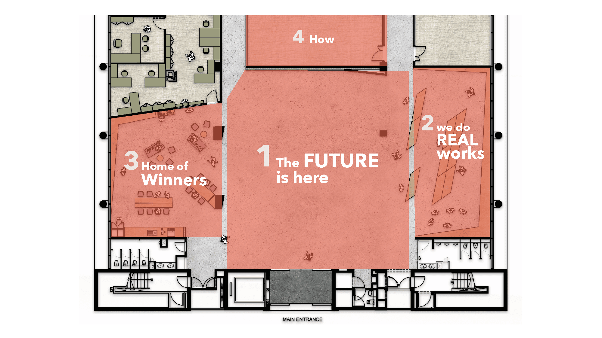
Stakeholder touchpoints located on the plan, with the content each one owns (Image 1)
Six cellular rooms became industry labs with glazed frontage; the admin office was pulled to the perimeter so the centre could be released (Image 2)

M3 Lobby Space proposal

Four zones, and the space allocation

Spatial Experience Design

Concept: The visit inspired like a storybook

A room can be looked at in any order. A story cannot, and the merged school needed a controlled order.
Essentially, reassurance before proof, proof before invitation.

Thus the walk was written to behave like the cover of a storybook and four chapters, each with a job, a set of essential elements and a physical mechanism that delivers it.
Naming the zones as chapters also solved a delivery problem.

It gave leadership and direction that we can name for the fit-out contractors, the AV integrator and the comms team. Providing a shared vocabulary, so arguments about content can become arguments about which "chapter" it belonged to.

School of Design & Media

Overview

The merger of NYP's School of Design (SDN) and School of Interactive & Digital Media (SIDM) created a single organisation but left key aspects of identity unresolved, as both former entities retained distinct visual elements and reputations.

Engaged to unify these legacies and ensure all stakeholders felt represented in the online and offline experience.
The design focus was to emphasise the journey through the foyer as a way to communicate the merged institution’s values and identity to diverse audiences.

Categories

Spatial Experience Design

Design Strategy

Brand and Identity

Date

2020 - 2021

Client

Nanyang Polytechnic, School of Design and Media

Role

Second Design lead: Identity system, Spatial narrative, Stakeholder alignment

|

Design the school's highest-traffic service touchpoint so that the merged proposition is understood, believed and remembered by five audiences; prospective students, parents, industry partners, alumni and the merged staff on a single walk, and build the identity system that survives outside that room.

Read details below

A merger nobody could see

A merger creates a single organisation chart, but it does not immediately answer visitors’ questions about the institution’s identity or quality. SDN was object-, place- and craft-based. SIDM was screen-, image- and code-based. After they merged, this new entity retained two logos, two colour systems, two reputations, and two applicant pools.

The physical environment also did not support the merger. The M3 ground floor served as a thoroughfare, linking the drop-off entrance to the south canteen, with teaching rooms along the way. This space hosted every open house, industry visit, and parent tour, but it provided no sense of shared purpose or identity, only a route from one point to another.

SDN + SIDM identities, M3 as-is and M3 as proposed; two entrances, opposing footfall, cellular rooms.

We approached the new identity and the spatial experience of the foyer as a unified project.

1. The identity needed to ensure both former faculties saw themselves reflected in the merged brand.
2. The M3 foyer had to communicate the combined proposition to five key audiences; prospective students, parents, industry partners, alumni, and staff, within the brief walk from the drop-off to the lift.

The design unit was therefore not the room nor the identity. It was the experience of this entity during a visit, online or offline.

Outcomes

2 Briefs, 2 Outcomes, 1 Approach

While the brief was written as two refurbishments. It was actually one integration problem with a spatial component.

Hover to reveal

A unified identity

2 Schools, 2 Heritage, 1 new identity

Hover to reveal

A Spatial Experience

It handles every open house, every industry visit and every parent tour. What does it communicate?

Identity Design

The identity had political work to do

Neither faculty could read the new mark as the other one winning.
That constraint did more to shape the system than any aesthetic preference,
and it is the reason the mark is built from inherited parts rather than a clean start.

Hover to reveal

The orange stayed

Carried over from SDN and pushed to a hotter, more contemporary red-orange, so continuity was visible without the old mark surviving intact.

Hover to reveal

The lowercase "i" stayed

Lifted from SIDM's wordmark and set into DESiGN and MEDiA. A deliberate signature that SIDM staff recognise immediately and everyone else reads as a typographic quirk.

Hover to reveal

2D and 3D

SIDM's flat, screen-based practice and SDN's dimensional, object-based practice were made into the system's own subject. Overlapping polygons in stepped shades of the same red generate depth inside a flat medium; leading lines set direction and perspective.

The result is a system that performs the merge rather than announcing it, and one that extends: the same polygons and leading lines become ceiling battens, floor inlays and partition geometry later in the building.

School of Design and Media New Logo

Hover to view [Before] and [After]

Logo Construction via 2D/3D perspective principles
+ Polygons contructed from them as part of the visual language system

Design Principles for the M3 Lobby Space

5 Questions that governed and guided us when designing the space

Before the layout, I mapped what each audience needs resolved and where on the plan it can credibly be resolved. Five stakeholder touchpoints came out of it, and they became the specification the fit-out had to satisfy

01

Where am I?
Orientation at the threshold, before anyone commits to walking in.

02

Who are you now?
The merged identity, stated once. It needs to be communicated clearly.

03

What do you actually do?
Three clusters, their diplomas, and current student and graduate work.

04

Why should I trust you?
Awards, alumni outcomes, industry partners, live projects.

05

What would it be like to be here?
Staff, students and visitors sharing one space rather than performing for each other.

|

Now, anything that did not answer one of the five questions did not get floor area.

Spatial Design

A layout that answers each of the 5 questions

(Image 1) Stakeholder touchpoints located on the plan, with the content each one owns
(Image 2) Six cellular rooms became industry labs with glazed frontage; the admin office was pulled to the perimeter so the centre could be released

M3 Lobby Space proposal

Four zones, and the space allocation

Spatial Experience Design

Concept: The visit inspired like a storybook

A room can be looked at in any order. A story cannot, and the merged school needed a controlled order.
Essentially, reassurance before proof, proof before invitation.

Thus the walk was written to behave like the cover of a storybook and four chapters, each with a job, a set of essential elements and a physical mechanism that delivers it.
Naming the zones as chapters also solved a delivery problem.

It gave leadership and direction that we can name for the fit-out contractors, the AV integrator and the comms team. Providing a shared vocabulary, so arguments about content can become arguments about which "chapter" it belonged to.

School of
Design & Media

Overview

The merger of NYP's School of Design (SDN) and School of Interactive & Digital Media (SIDM) created a single organisation but left key aspects of identity unresolved, as both former entities retained distinct visual elements and reputations.

Engaged to unify these legacies and ensure all stakeholders felt represented in the online and offline experience.
The design focus was to emphasise the journey through the foyer as a way to communicate the merged institution’s values and identity to diverse audiences.

Categories

Spatial Experience Design

Design Strategy

Brand and Identity

Date

2020 - 2021

Client

Nanyang Polytechnic, School of Design and Media

Role

Second Design lead: Identity system, Spatial narrative, Stakeholder alignment

|

Design the school's highest-traffic service touchpoint so that the merged proposition is understood, believed and remembered by five audiences; prospective students, parents, industry partners, alumni and the merged staff on a single walk, and build the identity system that survives outside that room.

Read details below

A merger nobody could see

A merger creates a single organisation chart, but it does not immediately answer visitors’ questions about the institution’s identity or quality. SDN was object-, place- and craft-based. SIDM was screen-, image- and code-based. After they merged, this new entity retained two logos, two colour systems, two reputations, and two applicant pools.

The physical environment also did not support the merger. The M3 ground floor served as a thoroughfare, linking the drop-off entrance to the south canteen, with teaching rooms along the way. This space hosted every open house, industry visit, and parent tour, but it provided no sense of shared purpose or identity, only a route from one point to another.

SDN + SIDM identities, M3 as-is and M3 as proposed; two entrances, opposing footfall, cellular rooms.

We approached the new identity and the spatial experience of the foyer as a unified project.

1. The identity needed to ensure both former faculties saw themselves reflected in the merged brand.
2. The M3 foyer had to communicate the combined proposition to five key audiences; prospective students, parents, industry partners, alumni, and staff, within the brief walk from the drop-off to the lift.

The design unit was therefore not the room nor the identity. It was the experience of this entity during a visit, online or offline.

Outcomes

2 Briefs, 2 Outcomes, 1 Approach

While the brief was written as two refurbishments. It was actually one integration problem with a spatial component.

Hover to reveal

A unified identity

2 Schools, 2 Heritage, 1 new identity

Hover to reveal

A Spatial Experience

It handles every open house, every industry visit and every parent tour. What does it communicate?

Identity Design

The identity had political work to do

Neither faculty could read the new mark as the other one winning.
That constraint did more to shape the system than any aesthetic preference,
and it is the reason the mark is built from inherited parts rather than a clean start.

Hover to reveal

The orange stayed

Carried over from SDN and pushed to a hotter, more contemporary red-orange, so continuity was visible without the old mark surviving intact.

Hover to reveal

The lowercase "i" stayed

Lifted from SIDM's wordmark and set into DESiGN and MEDiA. A deliberate signature that SIDM staff recognise immediately and everyone else reads as a typographic quirk.

Hover to reveal

2D and 3D

SIDM's flat, screen-based practice and SDN's dimensional, object-based practice were made into the system's own subject. Overlapping polygons in stepped shades of the same red generate depth inside a flat medium; leading lines set direction and perspective.

The result is a system that performs the merge rather than announcing it, and one that extends: the same polygons and leading lines become ceiling battens, floor inlays and partition geometry later in the building.

School of Design and Media New Logo

Hover to view [Before] and [After]

Logo Construction via 2D/3D perspective principles
+ Polygons contructed from them as part of the visual language system

Design Principles for the M3 Lobby Space

5 Questions that governed and guided us when designing the space

Before the layout, I mapped what each audience needs resolved and where on the plan it can credibly be resolved.
Five stakeholder touchpoints came out of it, and they became the specification the fit-out had to satisfy

01

Where am I?
Orientation at the threshold, before anyone commits to walking in.

02

Who are you now?
The merged identity, stated once. It needs to be communicated clearly.

03

What do you actually do?
Three clusters, their diplomas, and current student and graduate work.

04

Why should I trust you?
Awards, alumni outcomes, industry partners, live projects.

05

What would it be like to be here?
Staff, students and visitors sharing one space rather than performing for each other.

|

Now, anything that did not answer one of the five questions did not get floor area.

Spatial Design

A layout that answers each of the 5 questions

Stakeholder touchpoints located on the plan, with the content each one owns (Image 1)
Six cellular rooms became industry labs with glazed frontage; the admin office was pulled to the perimeter so the centre could be released (Image 2)

M3 Lobby Space proposal

Four zones, and the space allocation

Spatial Experience Design

Concept: The visit inspired like a storybook

A room can be looked at in any order. A story cannot, and the merged school needed a controlled order.
Essentially, reassurance before proof, proof before invitation.

Thus the walk was written to behave like the cover of a storybook and four chapters, each with a job, a set of essential elements and a physical mechanism that delivers it.
Naming the zones as chapters also solved a delivery problem.

It gave leadership and direction that we can name for the fit-out contractors, the AV integrator and the comms team. Providing a shared vocabulary, so arguments about content can become arguments about which "chapter" it belonged to.

The four chapters

Each one states its purpose, its essential elements, and the mechanism that makes it work when nobody is guiding the visitor.

0

|

the Cover page – Where am I?

MAIN ENTRANCE

The goal is provide a "sneak peak" before the reveal in Ch.1.

The lift lobby and sliding entrance carry a compressed preview of everything the visitor is about to meet: the mark, the red, the batten geometry, and the cluster colours used as floor-level coding. It resolves orientation before the reveal, so the next chapter can be spent on the school rather than on wayfinding.

Key point of design

Proposal vs Image taken during refurbishment

1

|

Start of something new

MAIN LOBBY

The reveal. A six-metre projection panel with paired front projectors and a backlit logo box sit at the end of the sightline, and the ceiling battens run as leading lines straight into them.

The whole composition is set out on golden-ratio construction, a device the school teaches, used as the room's own structure rather than as decoration.

Construction geometry, and the room built on it.

Cluster colours double as floor-level coding, so the identity system is also the wayfinding system.

2

|

This is SDM

GALLERY

Three clusters, (ie. Creative Media & Technology, Image Making, and Object, Place & Experience Making) each get a bay with its diplomas, their respective faculty colour and its current work.

Light-box panels and mounted displays carry work that dates; laminate pedestals on castors let the school reconfigure for open house, industry showcases and graduate shows without a fit-out budget.

Mechanism: fixed frame, movable content. The architecture is permanent; everything inside it is scheduled.

Mechanism: fixed frame, movable content.
The architecture is permanent; everything inside it is scheduled.

Mechanism: fixed frame, movable content.
The architecture is permanent; everything inside it is scheduled.

Usage layout and Organisation

Elevation. Each bay is readable at walking pace, at a distance, without stopping.

3

|

Trust us

ADMIN OFFICE & ALUMNI WALL

Proof, placed where visitors wait rather than in a trophy cabinet that most visitors do not intentionally travel to. The alumni wall, award record and partner work sit against the admin frontage, and the waiting and discussion area is folded into the same zone.

This way, a parent or client who is waiting for an appointment is sitting inside the evidence of SDM's reputation. The office edge was deliberately kept semi-open: sophistication against rawness, staff visible at work.

Two directors, three assistant directors, fifteen staff, relocated to the perimeter so the centre could become public.

Layout (Image 1) + Mock-up of the proposed Alumni Panel on the CDU (Image 2)

4

|

Work hard, play hard

ADMIN OFFICE & ALUMNI WALL

The last chapter was intentionally designed to be the one space that is not meant to be performative as it sits within the same shared space as Chapter 3.

A pantry, long shared tables and a projected wall of student and alumni portraits, positioned so that visitors see the school being used rather than displayed. It is also the honest answer to the welfare question every parent is really asking.

Mock-up of space

Feature wall concept illustration along the Admin office reception area

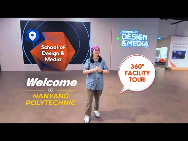
360º Facilty Walkthrough

Walkthrough of the sequence, in order. (Video by Nanyang Polytechnic, School of Design and Media)

(Image 1) Stakeholder touchpoints located on the plan, with the content each one owns
(Image 2) Six cellular rooms became industry labs with glazed frontage; the admin office was pulled to the perimeter so the centre could be released

Walkthrough of the sequence, in order. (Video by Nanyang Polytechnic, School of Design and Media)

Conclusion

Conclusion

SDM's brand and space was designed to be run, create ownership and not just to be built

SDM's brand and space was designed to be run, create ownership and not just to be built

While conducting our research, we noticed that most institutional foyers decay because the content model was never designed.
Ours was – right from ground 0, and it consequentially drove hardware choices more than aesthetics did.

While conducting our research, we noticed that most institutional foyers decay because the content model was never designed.

Ours was – right from ground 0, and it consequentially drove hardware choices more than aesthetics did.

Projection and light boxes instead of printed graphics in every zone that carries dated content.
Showcasing student work, awards, partners, live projects.

Projection and light boxes instead of printed graphics in every zone that carries dated content.
Showcasing student work, awards, partners, live projects.

Pedestals on castors with a laminate finish, so the gallery reconfigures for open house and graduate shows in an afternoon.

Pedestals on castors with a laminate finish, so the gallery reconfigures for open house and graduate shows in an afternoon.

Cluster colour as a governed system that runs from the lift lobby to the to various floors and faculties, giving the school one wayfinding language rather than a new sign family per project.

Cluster colour as a governed system that runs from the lift lobby to the to various floors and faculties, giving the school one wayfinding language rather than a new sign family per project.

One identity system with defined graphic elements. Polygons, shade steps, leading lines, so downstream collateral produced by staff stays consistent without a designer in the loop.

One identity system with defined graphic elements. Polygons, shade steps, leading lines, so downstream collateral produced by staff stays consistent without a designer in the loop.

A written brand guideline with production specifications. Pantone, CMYK, RGB and hex for every colour, cluster ownership, and explicit usage limits on the secondary palette. This is the part that outlived the project. The school has run its own material against it since.

A written brand guideline with production specifications. Pantone, CMYK, RGB and hex for every colour, cluster ownership, and explicit usage limits on the secondary palette. This is the part that outlived the project. The school has run its own material against it since.

Some things that I would specify now and also if I were given a larger scope, would be to have named content owners per zone, ensure that a review cadence tied to the academic calendar, and a fallback state for every screen to create a failsafe/closed feedback loop.

2026 Reflection

Why this project sits in a service design portfolio

It is the first project where I stopped treating brand and space as outputs and started treating them as the delivery mechanism for an organisational change that had already been decided and not yet been felt. The artefacts are a logotype and a floorplate. The work is stakeholder mapping, sequencing, content governance and a fixed set of questions that every design decision had to answer.

This is essentially still the same operating method I now apply to systems with far more moving parts, such as workforce transition programmes, environmental monitoring ecosystems, public-sector service redesign.
Different perspective, different scale, same discipline.